
Van Briggle Glazes Produced in all the Colors of the Colorado Landscape
By Kathy Honea & Bob Teas
When asked to write an article on Van Briggle pottery, as a collector and bit of historian, I recalled many questions pertaining to the name of specific glaze colors. There are several means to attempt a determination of a glaze name; however, some glazes were never documented. Studying vintage Van Briggle brochures, advertisements, magazines, news stories, dating of the pottery, and the appearance of the pottery can be advantageous.
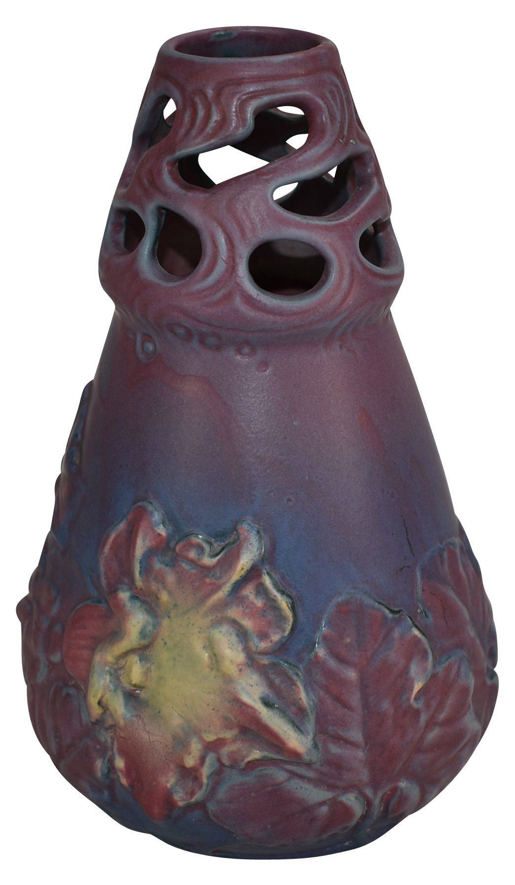
Very early descriptions of Van Briggle pottery include characteristics such as high-fired, dead-matte glaze, dipped & sprayed, multi-layered, etc. One author described early Van Briggle “as having the appearance that one could reach out and brush away the dust atop the glaze.” This 1902 vase, hand-thrown & inscribed by Artus Van Briggle, is an excellent example of that “dusty” appearance.

Early Glaze Colors 1900-1912
The earliest known list of glaze colors was written by Frank Riddle in a small booklet dated July 8, 1902. It documented names of 21 colors in use, as well as experimental colors.
Another document, “Color Groups of Early Van Briggle Pottery,” was located in the Van Briggle Company archival files. Neither of those listings is accompanied by any “color swatches” to use as comparisons. The undated color listing from the VB files included:
- Blues: Light Blue, Turquoise, Medium Blue, Dark Blue, Navy Blue
- Greens: Light Green, Lime Green, Medium Green, Dark Green, Olive Green
- Browns: Light Brown, Medium Brown, Dark Brown, Golden Brown, Claret Brown
- Yellows: Light Yellow, Medium Chromium Yellow, Mustard Yellow, Dark Golden Yellow
- Pinks: Light Pink, Medium Pink, Dark Pink, Mulberry, Dark Plum
- Lavenders: Light Lavender, Dark Lavender
- Grays: Grayish-White, Light Gray, Medium Gray
- Black
One report of color specificity is that the mustard glaze was intended to copy the golden glow flowers (perhaps today’s Goldenrod flowers) in the garden south of Artus’ pottery at 617 N. Nevada Ave. In a letter to Frank Riddle; March 2, 1904, from Tucson during his convalescence, Artus inquired about the status of changes made to the saggars and interior glazes. Artus also inquired about the black, olive, and new yellow glazes.
After Artus: Anne’s Tenure 1904-1912
After Artus’ death 7-4-1904, the “Catalogue of Van Briggle Designs” by Robert Wyman Newton and the 2015 Revised Edition; both show the period from mid-1904 to 1907 with many “plain” designs. J. Emma Kinkead, who worked with Artus and also with Anne until the teens, recorded that Ambrose Schlegel created all these “plain” designs, from which moulds were made for production until Anne returned to designing full-time. Many of these were adorned in magnificent color glazes, and some with more than one color overspray.
One of the earliest multi-page booklets we have is a hand-dated 1908 copy from the family of a 1906 potter, Thomas Alston. Quotation within the booklet reads:
“We believe it better art to bring out a limited duplication of a beautiful and carefully thought out design, varying in each piece the color and glaze effect, than to seek and execute hastily a new design for each piece. The color range is wide and very suggestive of Colorado, reflecting with equal fidelity to nature the brilliant turquoise of the sky, the reds, grays, browns, yellows, blues and purples which exist in striking effect in the crags and canon walls and in the more subtle tone of the incomparable dawn and twilight of the plains.”


The brochure states, “Dull yellows, browns, greens, blues, pinks, grays, and blacks, in many shades and varieties of effect, represent the wide range in color.” The pottery shown was first designed in 1901 and 1902 and until the middle of 1903; therefore, leading us to believe this brochure was produced in 1903 or after.
The period of late 1907 to early 1912 has been called the period of the most prolific variety of glazes. Some refer to this as the “1908-1911” period, as there are a few pieces dated both 1907 and 1912.Anne would have returned to designing after her husband’s death and her time spent planning the 1908 Memorial Pottery in his recognition. I cannot say that I believe the 1907-12 period is any greater representation of glaze variety. Perhaps many are more familiar with the 1907-12 pieces than the smaller number of very early pieces.
Van Briggle Ownership Changes 1912-1920 Result in New Glaze Colors
VAN BRIGGLE Decorative Tile and Terra Cotta is a multi-page full-color brochure, with E. de F. Curtis listed as Manager. This booklet is in very scarce supply and includes full-color Van Briggle fireplaces, pottery, and tile. It also includes a full-page Van Briggle Price List. Another full page is comprised of 17 color swatches in addition to listing Black, White & Cream. NONE of the color swatches are given a Glaze Color Name! Instead, they are referred to by a number only for use in customer order placement.
There were, however, NO color swatches that have survived to our knowledge that would guide us in assigning a particular name to any glaze color.
We have within our collection several pieces in the color once sold to us as “tobacco spit.” We have since referred to it as “tobacco.” Comparing this color chart from E. de F. Curtis, ca. 1914 – I believe our “tobacco” glazes may now be correctly identified as Color Chart #40!

Van Briggle Brochure, E. de F. Curtis (1912-1915)
Color Chart for Glazes – Decorative Tile and Terra Cotta
From 1915 to 1920, Mr. Charles Lansing managed the pottery. He had the business knowledge and capital to stabilize the business. However, in 1917, he enlisted in the U.S. Army. In 1919, the pottery suffered a fire, badly damaging the center portion of the building.
From a 1916 Vogue magazine advertisement by Van Briggle, we learned the following glazes were offered: “Colors in rose-pink, turquoise blue, green, orange and Copenhagen blue.”
 |
 |
 |
| Pink-Rose | Turquoise Blue | Green |
 |
 |
| Orange | Copenhagen Blue |
Many Changes under J.H. & I.F. Lewis 1920-1969 Ownership
By 1920, Mr. J.H. & I.F. Lewis acquired the pottery. It was during this tenure that the pottery began to cater to tourist travel and produce small items for the visitors to purchase as gifts and souvenirs when they toured the facility. Brochures from this period mention most often the glaze colors: Turquoise Ming, Persian Rose, Mulberry, and later, Moonglo – an off-white glaze.
In the 1920s, there was exportation of Van Briggle, particularly to Australia. These pieces include the USA mark on the bottom markings. Some have stated this period as 1922-26, and others as 1922-29. The most common glaze colors advertised and found with the USA mark are Turquoise Ming, Persian Rose, Mulberry, and Mountain Crag Brown.
One 1920s advertisement in the Colo. Spgs. Directory states, “The Quality of Van Briggle Textures is Unequaled, and our Range of Colors is Unlimited.”
Historically, the formula for the Mt Crag Brown glaze was lost in the fire of 1935. One worker who had memorized it; produced a single batch in the 1950s. The use of a production mark with “a cobalt stick,” as described by potter Fred Wills during the 1950s, can help one differentiate from the pre-1935 Mt Crag Brown & 1950 Mt Crag Brown pieces.
1968 Sale of 1908 Memorial Pottery & 1969 Stevenson Family Acquisition of the Pottery
In 1969, the Stevenson family acquired controlling interest of the pottery and its sole location at Midland Terminal Railroad Roundhouse, which had been owned and in use as a second pottery location since 1953. It was after this time that Jeff Stevenson, a ceramic engineer, and Craig Stevenson, a sculptor, each made a significant enhancement to the pottery operations.
Jeff Stevenson has furnished much vital information as to the glazes he created and dates of production during his tenure. Examples of pottery in these colors with names & dates of production are reproduced on the website www.vanbrigglenotes.com and the pull-down menu GLAZES.
Under Craig Stevenson’s direction, many other designs and glazes were produced. He advertised these in brochures and included glaze color samples on their web page.
Deciphering the information on the bottom of the pottery for determination of age may also be used to determine glaze colors known to have been produced within certain years. Dating methods using clay color, handwriting, etcher/finisher, and potter marks are all included on www.vanbrigglenotes.com with the pull-down menus titled “DATE MARKS” and “VB ID GUIDE.”
Glazes Perfected to Match Customer Requests
Lastly, a 15-page VB brochure containing designs created through 1912 and using a cover photo, which had been copied from a 1914 postcard; contains this paragraph which may best explain that we may never know all the glaze colors created by Van Briggle!
“Our colors are widely varied and include the now famous Van Briggle Turquoise Blue, Pink, Yellow, Plum, Violet, Lavender, Old Rose, Apple Green, Grass Green, and a world of shades of each. If you can’t describe just what you want, send us a piece of paper or cloth the color you have in mind and we will match it as nearly as possible for you.”
Can you imagine having had that opportunity?
A Few Tips to assist in dating & identifying glaze colors of Van Briggle Pottery
- Identify the Design Number of your ware. There is the Catalogue of Van Briggle Designs for designs first created between 1900-1912. There is also a Design Record of those produced in the Mid-Century period. A few of those are the original 1900-1912 designs – however renumbered! Others are designs occurring after 1912. Still, others are designs made from Dryden Pottery moulds from 1955-1968.
- Read Van Briggle Advertisements placed in newspapers, magazines, or other sources sometimes list specific color glazes produced that year. Example: 1916 VB ad in Vogue magazine states colors that year included “rose-pink, turquoise blue, green, orange and Copenhagen blue.”
- Peruse any VB brochures you can obtain. Very few were dated; however, it may give a hint in the description, such as “produced at the base of the Colorado Rockies for the last 20 years.”
- VB pottery was, for the most part, dated between 1901-1920. There are many different “styles” of dating or usage of other marks without a date, such as those produced in the 1907-12 period. Pieces produced for export (differing opinions say either 1922-26 or 1922-29) include a USA mark.
- A Gold Ore Glaze was produced for only three months in 1956, per a Colo. Springs newspaper story.
- Production and original pieces made in 1984 and 1985 are usually signed with an ’84 or ’85.
- The “bark-like” covering of a Van Briggle glazed piece was produced for the 1933 World’s Fair.
- In 2000, Craig Stevenson instituted a letter-date system that would have lasted until 2100.
- Special events sometimes produced a special mark, such as VB 100K for wares made in the Centennial Kiln. VB100 indicated a piece produced in the first three months of the year 2000. VB100 was used for the remainder of the year. New glaze names were sometimes introduced for those events and contained with the brochures for the events.
Artus’ tenure at the pottery was critically short. Anne & J. Emma Kinkead worked for years to design all the 5,000+ tiles to cover the interior & exterior of the 1908 Memorial Pottery building. The 1919 fire damaged the interior. The 1935 Flood damaged several areas and washed away many records & moulds. Yet they persisted in the production of beautiful pottery, tile for mantels, hearths, floors, bathrooms, wainscotting, interior & exterior tile, friezes, roof tile, terra cotta, enameled brick, garden pottery, wall fountains, electrical fixtures, advertising novelties, quarries and more. Some of all have survived, and we are fortunate for these!