
You can use color in many different ways in a decorating context. You can use it as a theme or contribute to a particular style. You can also use color to create a chosen mood. For example, a combination of soft, harmonious colors can create a restful feeling, while bright yellow is happy and cheerful.
Different colors also have a sensory effect on temperature too. Generally, red, orange and yellow are warm, while many blues are cool. Adding to this, you can also use cool colors to make a room seem more spacious.
But how does all this relate to art pottery?
How to Use Art Pottery to Add Color to Your Home

The most obvious way to use art pottery to add color to the interiors of your home is to choose hues that match painted walls, carpets, or upholstery. Of course, if you have a color theme, you can match art pottery colors to your chosen theme. Alternatively, you can use it to create a contrast.
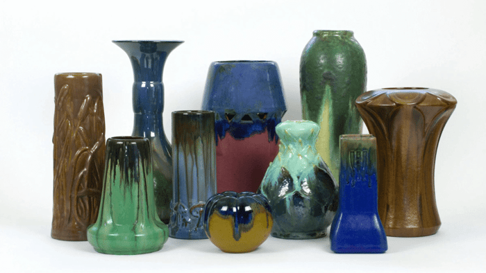
If you don’t have a color scheme as such, simply displaying colorful art pottery tastefully in your home can add very special finishing touches. Display one piece on its own or combine a rainbow mix for effect.
Using colorful art pottery as an accent can create a particularly powerful impression. If you think of nature and how flowers introduce color accents, you should easily find inspiration.
Imagine a bright red poppy in a field of green leaves. The first lavender-blue flower heads in a bed of gray leafy undergrowth. Bold splashes of color against any backdrop nature provides. The bright red-orange flowerhead of an aloe plant stretching high above the mix of greens and other flower colors in a garden bed.
It really doesn’t matter what sort of art pottery you use as an accent. It may be a vintage pottery bowl, a jug, a candlestick, an umbrella stand, a statue, or an objet d’art. What is important is its form and color. Strong colors work well, but you can use any contrasting color as an accent.
Art Pottery in Red
Bold, vibrant, and passionate, red is a color of strong contrasts. It ranges from the color of poppies, cherries, tomatoes, and various berries, to the deep hues of red wine. When used as a color theme, a red interior can incorporate a wide range of reds, even with a touch of lighter corals and pinks.

Your art pottery piece doesn’t need to be solid red, but it can be. What could work particularly well as a red accent is a Roseville Silhouette piece. Perhaps a bowl placed on a small table or mantelpiece or a red Art Deco window box.
Van Briggle art pottery also features some stunning mulberry red vases, bowls, planters, antique wall pockets, and figurines. Try Mulberry Red for something different. Then display red roses, carnations, or boldly colored tulips in the vases, this way combining shades of red for impact.
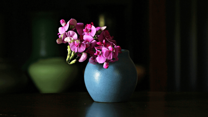
Blue Art Pottery
Blue skies, blue seas, the gray-blue of an impending storm. Or what about the blue colors of semi-precious stones like deep-blue sapphire, greenish-blue aquamarine, bright blue lapis lazuli, and blue-green turquoise? These are such different blues as are the colors of blue flowers: lavender, hyacinth, cornflowers, and irises.
Depending on the blue color of your art pottery, an accent piece can look fresh, lively, bright, elegant, or formal. By combining pieces that are different blues, you will add character and interest.

Some examples from our current stock include several Van Briggle pottery items. A vintage Arts and Crafts blue poppy plate, a blue hand-thrown vase from the 1990s, and an intriguing native American wall plaque in different tones of blue.
There are also some stunning blue Rookwood, Fulper, and Newcomb College Art Pottery vases in a range of shades.
In a room with dark navy blue tones, a Weller vintage Art Deco three-footed cornflower blue vase would make a gorgeous accent. Or for something completely different, how about a vintage paperweight from Rookwood to draw attention to itself?
Yellow Art Pottery
We associate yellow with sunlight, sandy beaches, and spring flowers. It is also one of the colors you will see in a glowing fire or autumn sunset. But yellow hues also vary considerably from the color of daffodils, pale primroses, saffron or turmeric, to gold.

Bright, happy, sunny, warm, and lively, yellow has been used for decoration for centuries. The Romans used saffron to color clothing, while in medieval times, painters used ochre and sienna pigments for their paintings.
Used as an accent color, whether for cushions, paintings, or objet d’art, yellows generally freshen a room. When it comes to art pottery, you will find all sorts of yellow hues, as well as yellow combined with other colors.

A yellow, brown, and orange California Modern Deco bowl in our online shop is a great example of how to add yellow zest in the form of an accent. It could be displayed on its own or alongside multiple yellow art pottery vases.
There are lots of available yellow items from Rookwood including some lovely, eye-catching paperweight figurines including cats and rabbits. Their yellow and green sunflower pattern planters would also add a splash of welcome yellow to a dull room.
Green Art Pottery
Most of us consider green to be the ultimate color of nature. It is restful, fresh, soothing, cool, and mostly beautifully natural. Green colors range from dark pine green and clean, bright emerald green to malachite, jade, and apple green. Even bright, light, yellow-green lime fits the description.
Whether displayed as part of a green color scheme or as an accent, green fits any style setting. If you think about the impact that simply displaying green plants has, you will appreciate the aesthetic value of green art pottery.

Like the other colors mentioned, some art pottery is completely green, while other examples combine patterns and a variety of colors. The different green shades are amazingly varied, and because it is a popular range of colors for artists, the choice is big.
An obvious choice is Grueby pottery, which is known traditionally for its matte green glaze that became ubiquitous during the Arts and Crafts movement.
Just Art Pottery has some interesting and very beautiful matte green arts and crafts pottery from makers including Marblehead, Teco, Owens, Weller, Rookwood, Grueby, Roseville, and more.
While our available range changes constantly, any of a number of planters, vases, or bowls can make a stunning accent piece that can add color as well as interest, texture, and pattern.
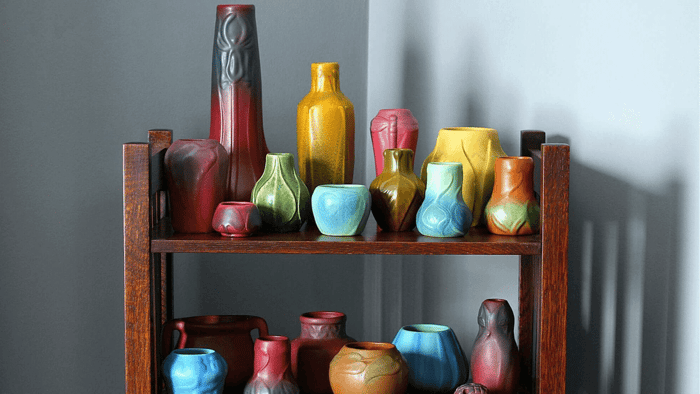
How Important is it to Choose One Predominant Color?
Using one color in different shades can make a greater impact than displaying art pottery of more than one predominant color in one room. That is if you are aiming to focus on color. But many collectors focus on specific makers or shapes, and so their prize art pottery possessions are a mix of colors.
Ultimately, whether you are a collector or simply someone who values one or more items of art pottery, it’s important for you to enjoy what you have. Contact us or browse our collections to find your next favorite piece.